Innovation & Product Design
Managing a workforce
What we were working on
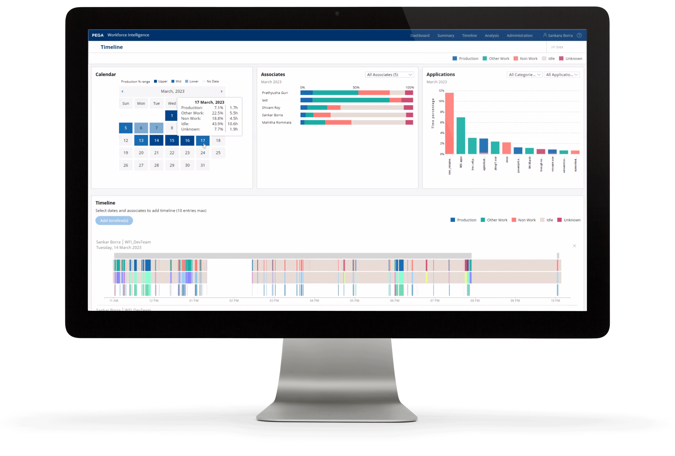
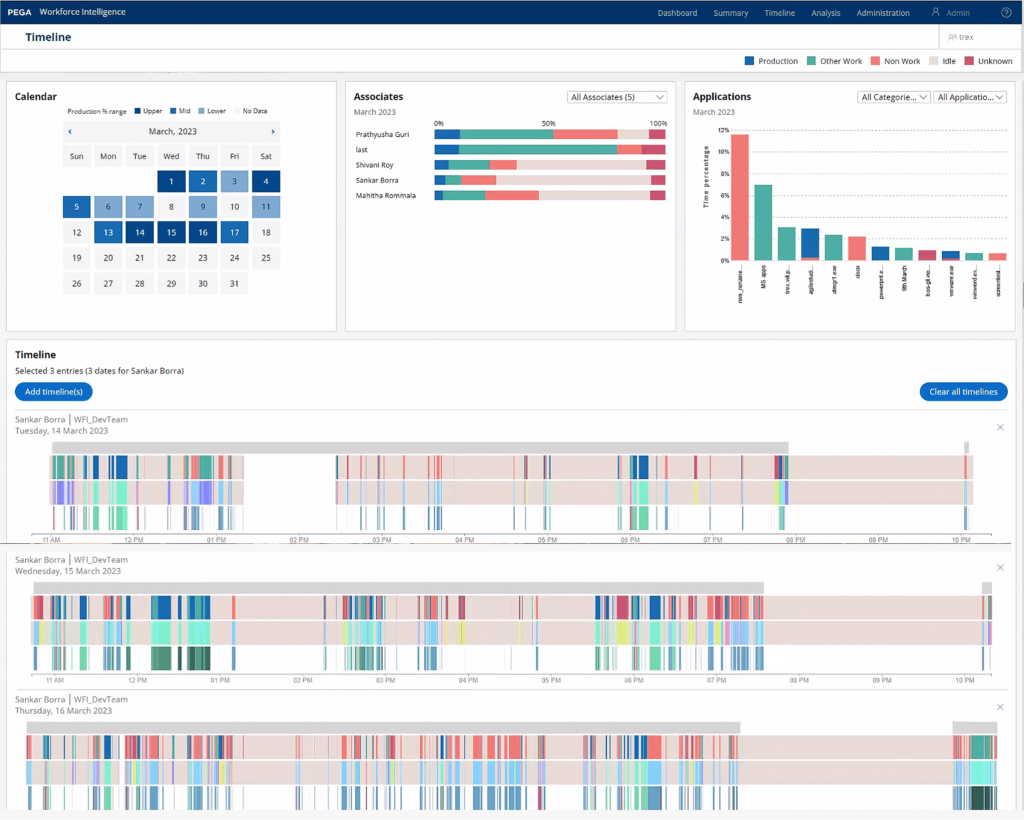
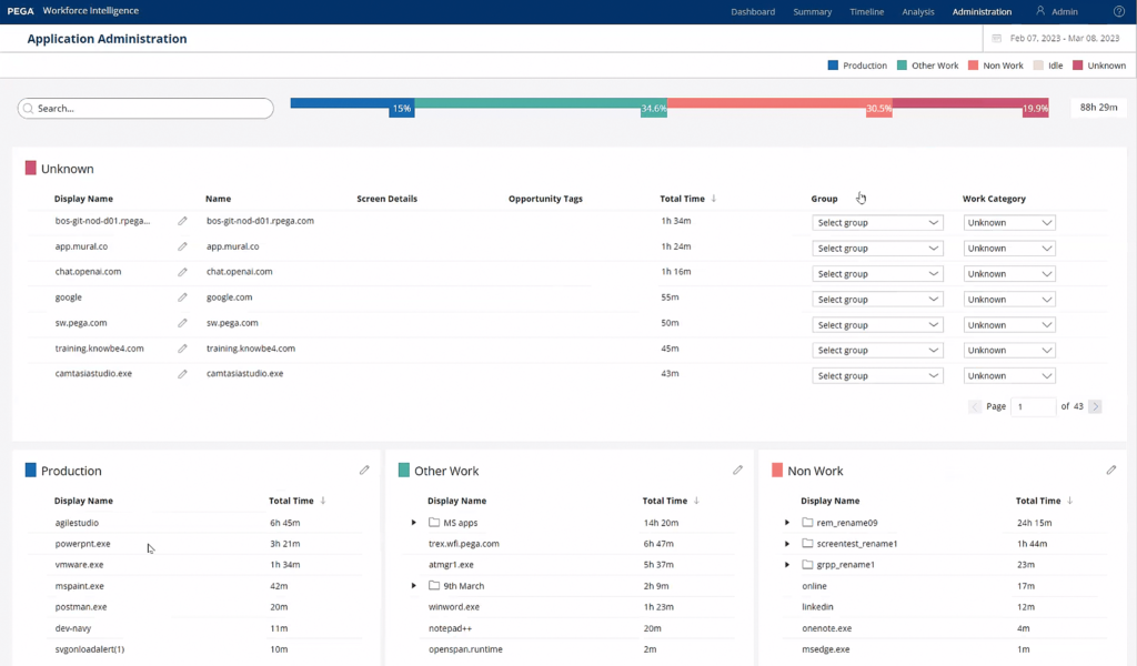
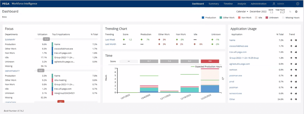
An analytics solution that brings minute-accurate transparency to where employees spend time on, enabling organizations to uncover opportunities for improving integration of tools, and optimizing workflows.
Workforce intelligence can identify areas where cognitive load can be reduced. Such areas are where employees have to switch tasks frequently, switch between systems or interfaces to get a task done.
What I did
Pega acquired OpenSpan, a Robotics Process Automation (RPA) software in spring 2016. The capabilities are available to Pega customers since 2017.
I was brought in by the leadership team of the product area for a second opinion after the team was told by the original designer assigned to the product area months ago to have the product re-designed and re-built the product AFTER the team completed the migration to the Pega tech stack.
- Analyzed a demo application presented by the product manager.
- Humanized data points where appropriate by redefining what goes in bins.
- Proposed an alternative binning and data encoding method which solved the issues.
- Involved the original designer, shared my rationale and how to solve it.
- Created mock-ups of the final solution with two additional variants exploring alternate data encoding approaches, and involved the other designer and product manager.
Outcome
ON USER EXPERIENCE LEVEL
- Users get to interact with the data set visually. Colors are assigned in such a way that users intuitively know what they are navigating.
- Semantic data encoding is indicative of whether a data point is neutral and informative or requires attention
- Assigned colors are accessible to color blind users
- Humanized approach to workforce insights which improves employee satisfaction.
ON an organizational LEVEL
- Saved at least an immediate USD 1 million
- Continue strategic direction for the product area as planned