INNOVATION & PRODUCT DESIGN
Accessible data visualization
What we were working on
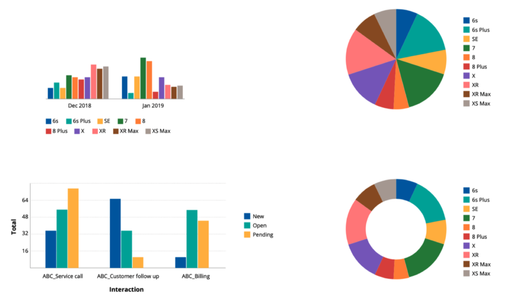
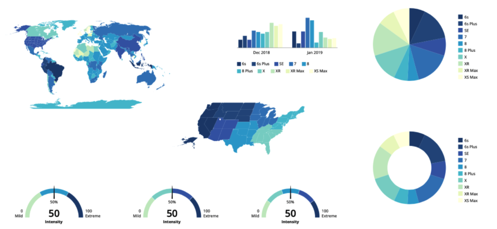
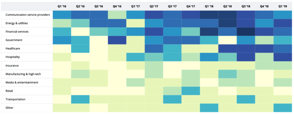
A set of “standard” visualization methods and color palettes that make data visualizations look like the Pega brand, while at the same time being accessible.
What I did
I was leading the design for data visualization capabilities at Pega by aligning various data visualization libraries with each other, enhancing visualization capabilities, and improving data encoding methods.
- Researched data visualization methods
- Collaborated with Marketing and Creative Services to align with corporate colors
- Interviewed stakeholders to define goals and scope
- Identified encoding use cases to be supported
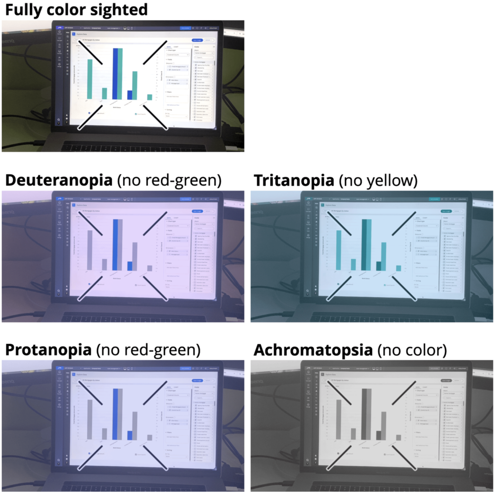
- Evaluated data encoding in the context to accessibility
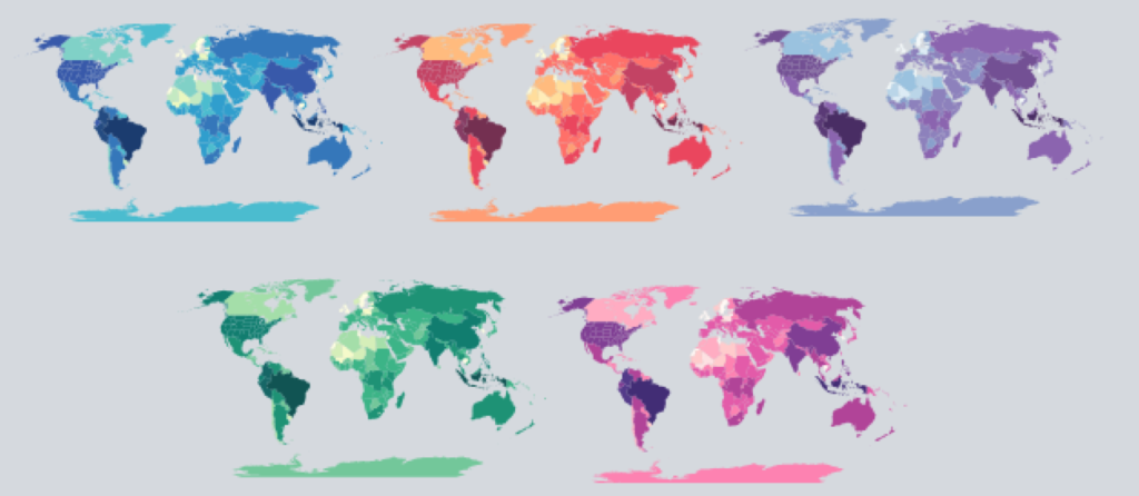
- Created color palettes for categorical, continuous and divergent data encoding
- Performed usability studies with color-blind participants to adjust palettes
- Collaborated with front-end developer to interpolate key colors and build color palettes into the design system
Outcome
On a project level
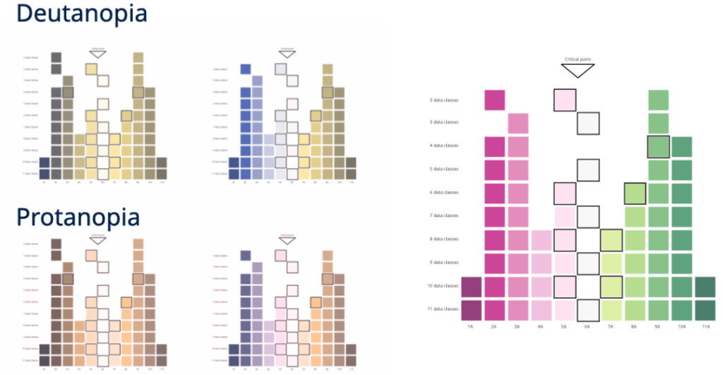
- Total of 23 palettes that cover four main types and four sub-types of color blindness
- Each color palette can interpolate tints and can scale up to 200 classes required for granular heat maps
- Two extra red-amber-green palettes tailored to the needs of two different types of red-green color blindness